
Scheme of the Week - Dark Inky Blues...
This week we’re looking at designing an interior scheme with Dark Inky Blues, a colour that works so well across all seasons. Whether you’re creating an elegant formal room in an urban home, cosy loung in a country cottage or cool Hamptons beach-house vibe, using these colours and prints can create the look.

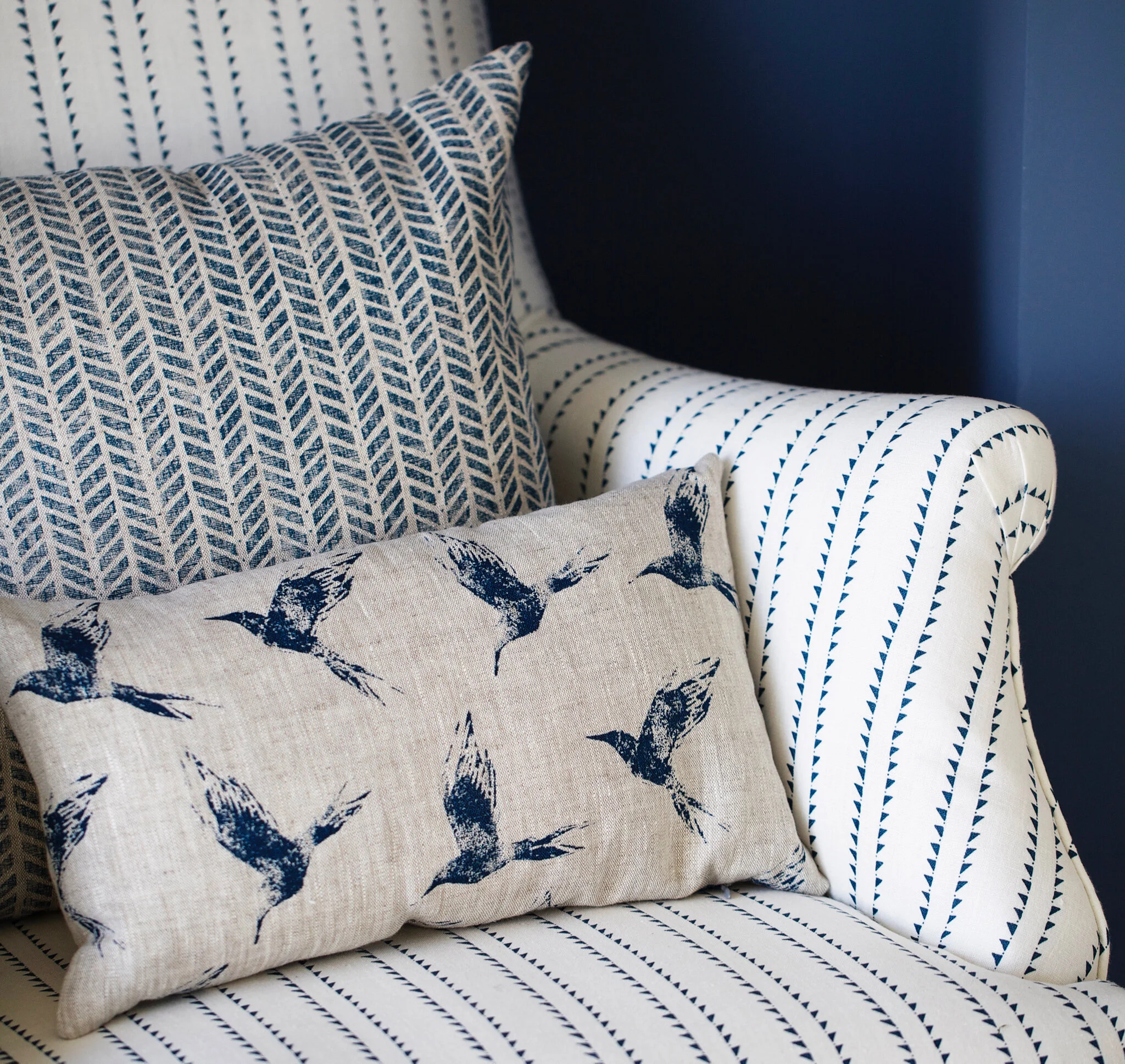
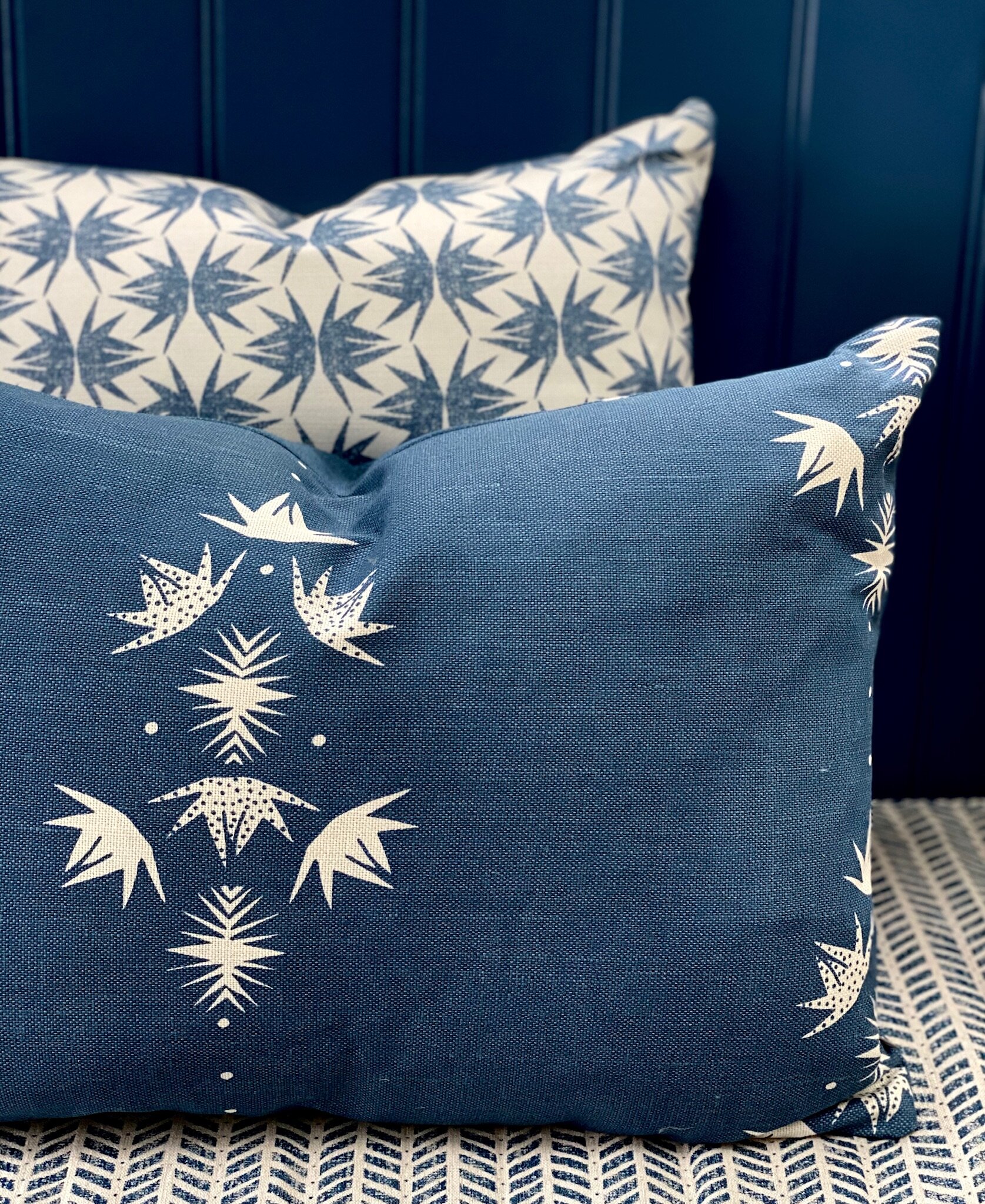
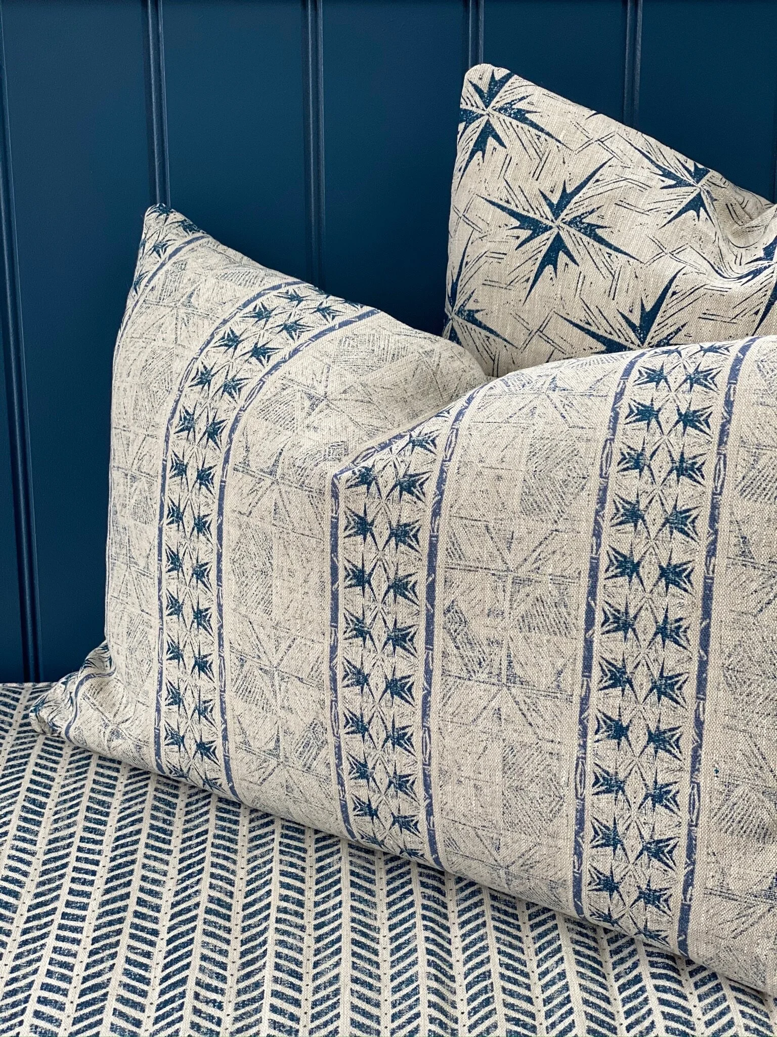
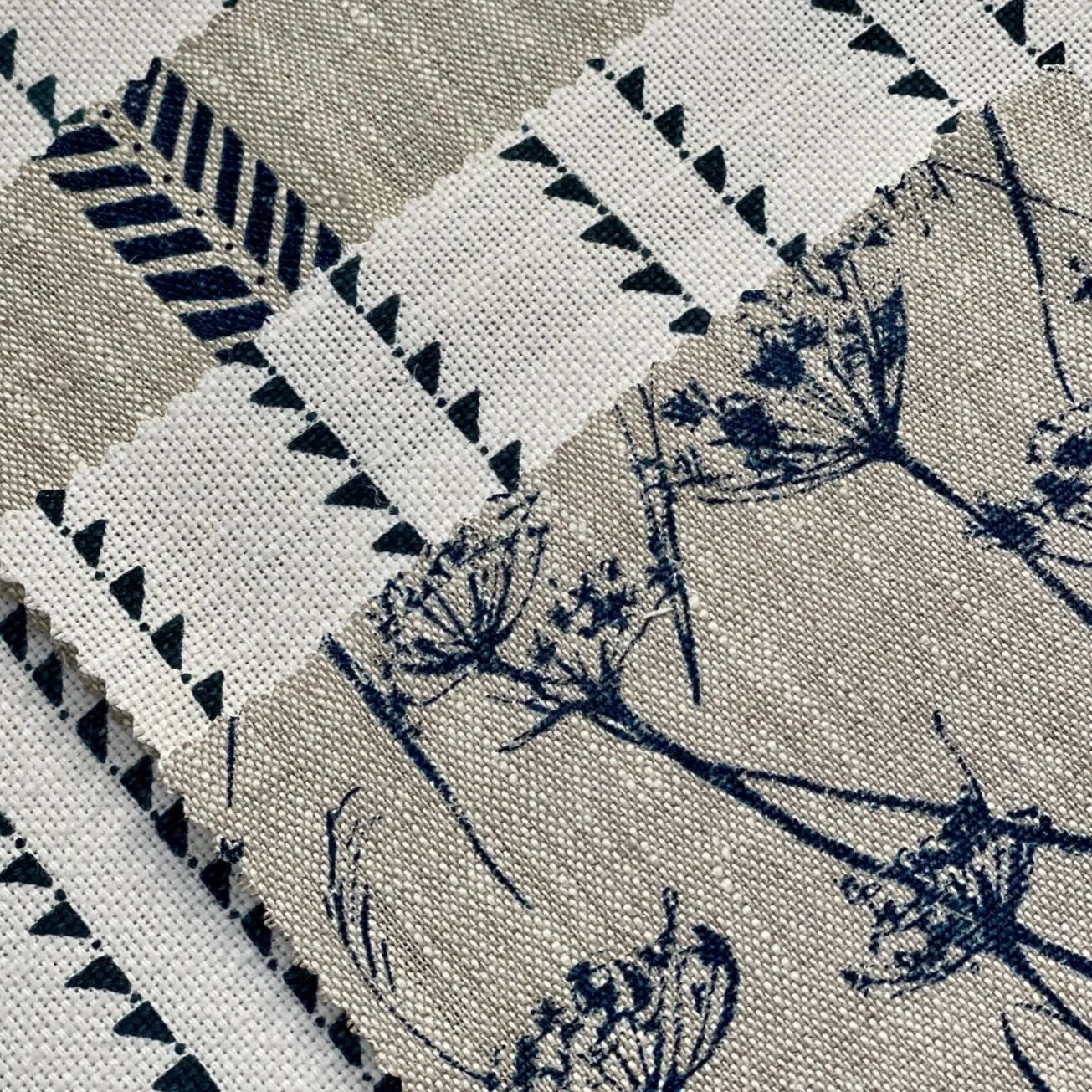
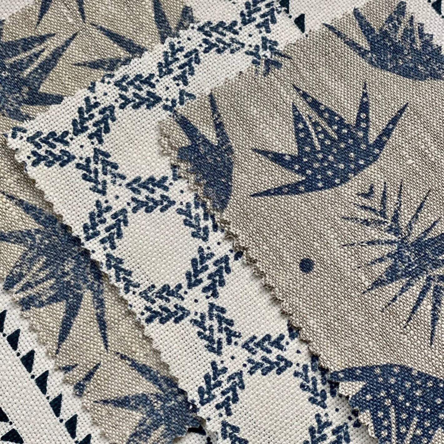
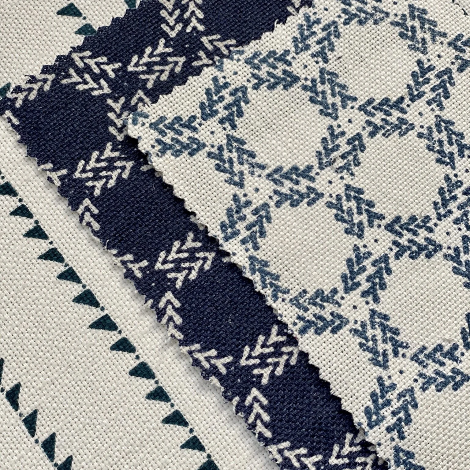
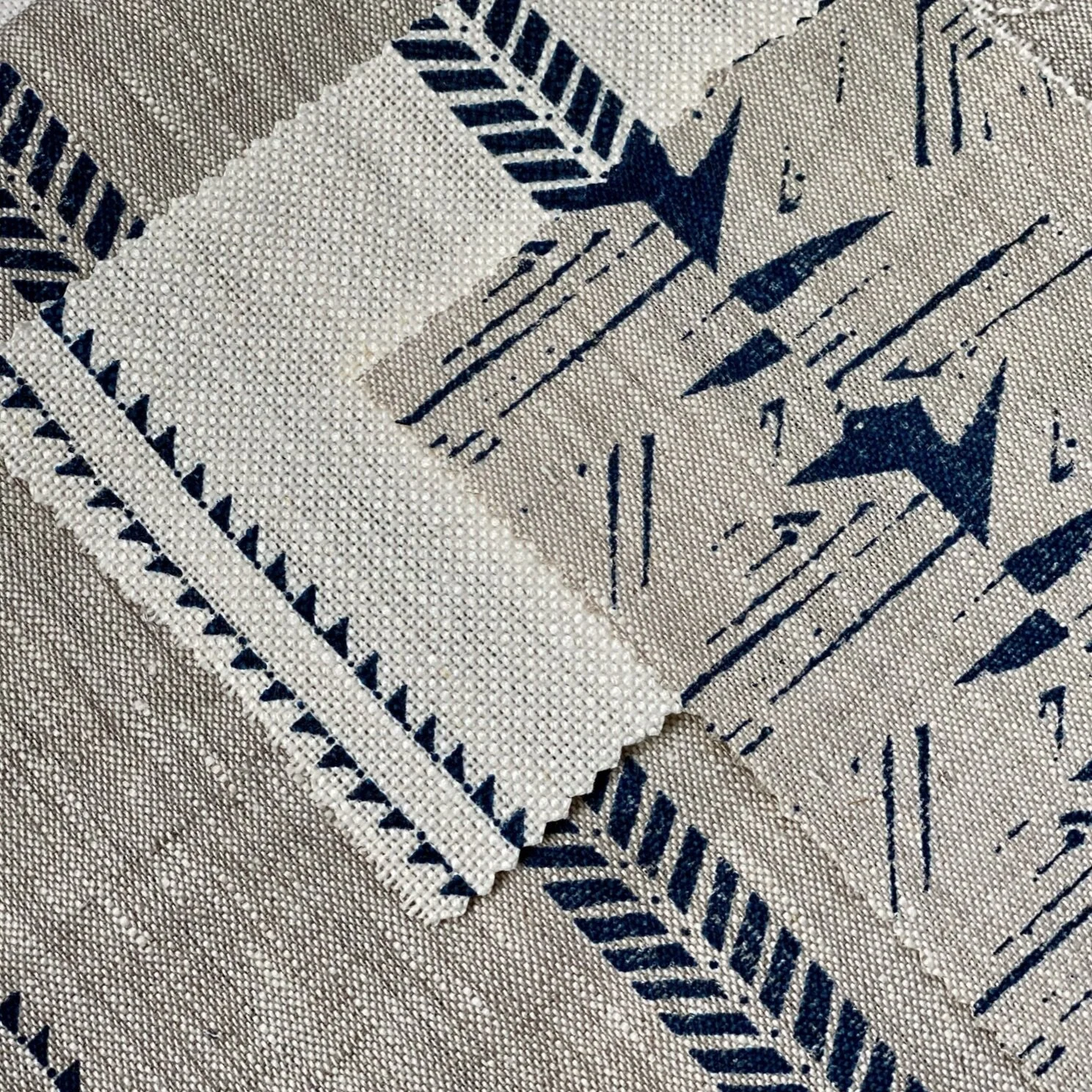
Lampshade: Bollin Bird Inky Sky Medium, Ivory Pompoms, Bollin Bird Inky Sky Fabric, Cushions in Whirlwind Inky Sky & Tagg Inky Sky, Slade Stripe Inky Sky on White with pom-pom cushion, Bollin Bird Cushion, Adlington Cowparsley Inky Sky fabric, Cushion: Adlington Cowparsley, Wallpaper Bollin Bird Gold & Deep Ocean, Candle accessories Nordic Story triple & single wick candles.
Creating the backdrop: Setting the scene
Blue is a favourite colour of mine and for many years now I’ve loved using dark blues as a backdrop to my fabrics. It’s a really great colour for ANY room, especially a lounge and as window dressings in a kitchen. There are some great paint colours out there that work well with our fabrics. To create the look I would recommend:
Blue Blood by Paint & Paper Library (a mid/dark blue shade with a slight greyness to it). This colour is great if you’re new to painting with colour in your home and this is the first time that you’re braving it.
Stiffkey Blue by Farrow & Ball (a rich dark blue).
Hague Blue by Farrow & Ball (a slightly greener tone of dark blue)
Bond Street by Mylands for an super dark atmospheric scheme - great for snugs, TV rooms or sultry bedroom vibes.
Alternativley for something lavish, patterned and indulgent try our Bollin Bird on honeycomb wallpaper in Gold & Deep Ocean. These papers work well for a luxe formal dining room scheme, W.C or dressing room.
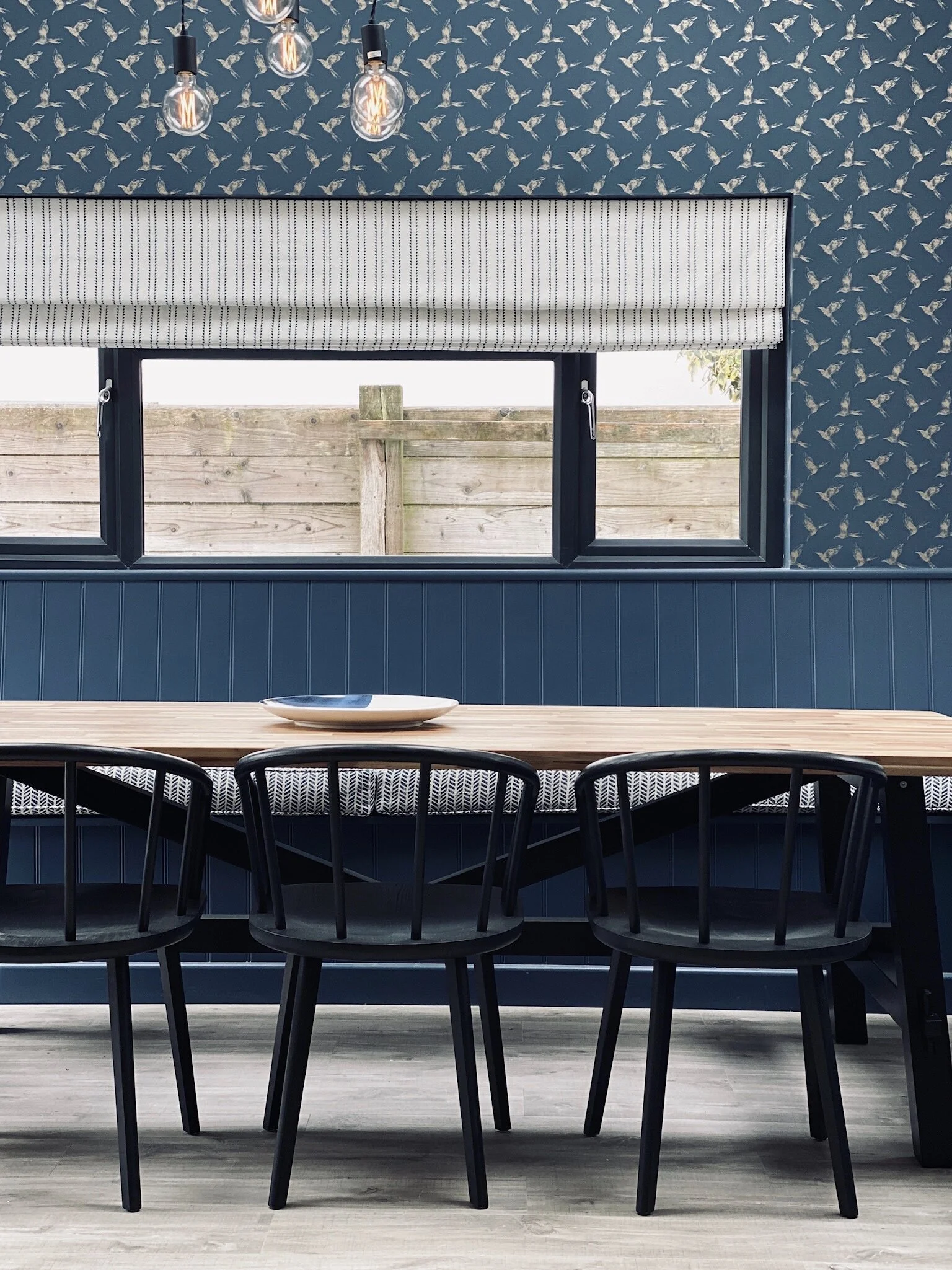
Bollin Bird Wallpaper, Windmill Wood Inky Sky roman blind, Mottram Meadow Inky Sky seat pad
Of course you can work with more neutral walls for a lighter scheme. Some of my favourite neutral paint colours when looking to add in linen fabrics are Purbeck Stone by Farrow & Ball and Strong White by Farrow & Ball.
Chosing the Fabrics
I would always suggest chosing 3 -5 fabrics (only three fabrics if you’re opting for a wallpaper) to combine in one room. Consider your windows first of all (curtains or blinds). If you’re going for curtains I would always recommend full length. Furthemore as was once recommended to me by a wise curtain maker, black out line everything (even if it’s not a room you sleep in) becuase it be presents the colour and textures of the fabric in all lights. Without blackout lining on a sunny day if you’re room is south facing the sun will highlight the lining colour (often yellow in tone) as it grins through the fabric. Please note that all of our fabrics are perform to British standards on light fast testing so can be used for any curtaining or blinds.
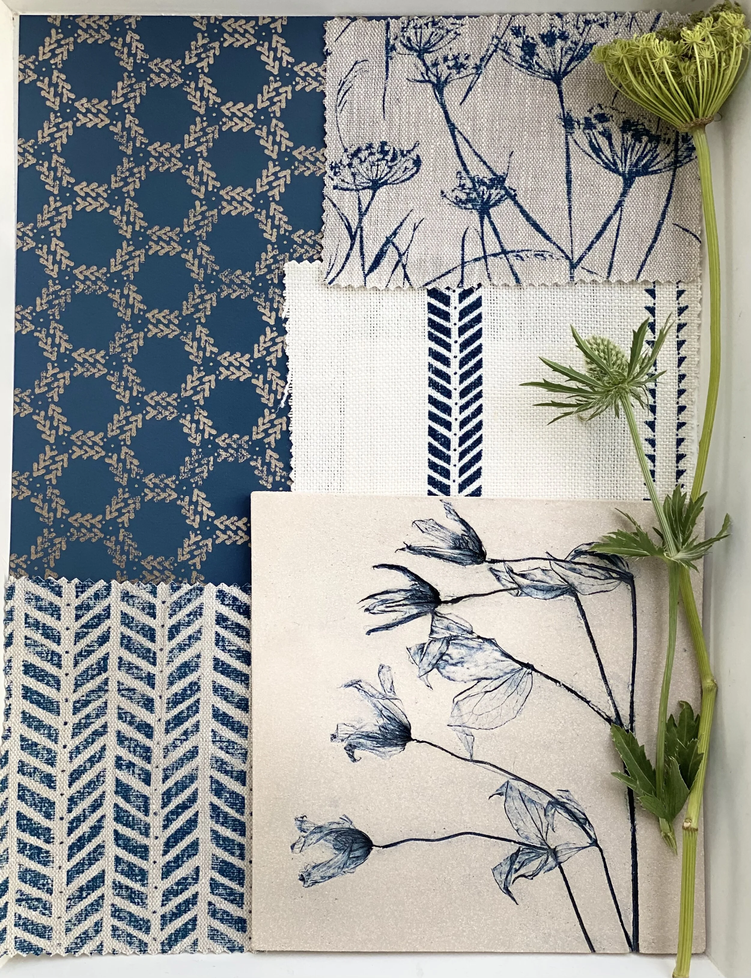
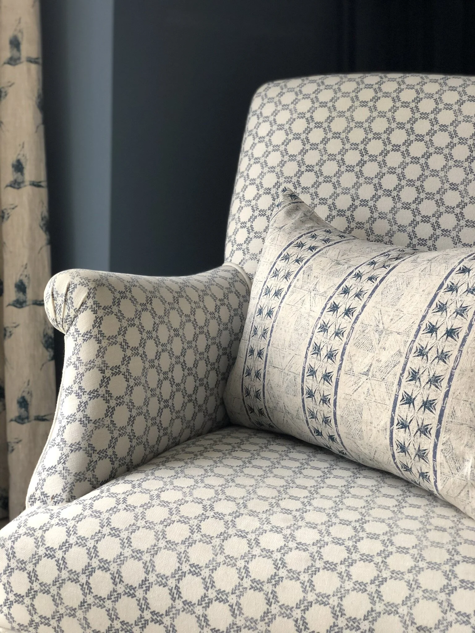
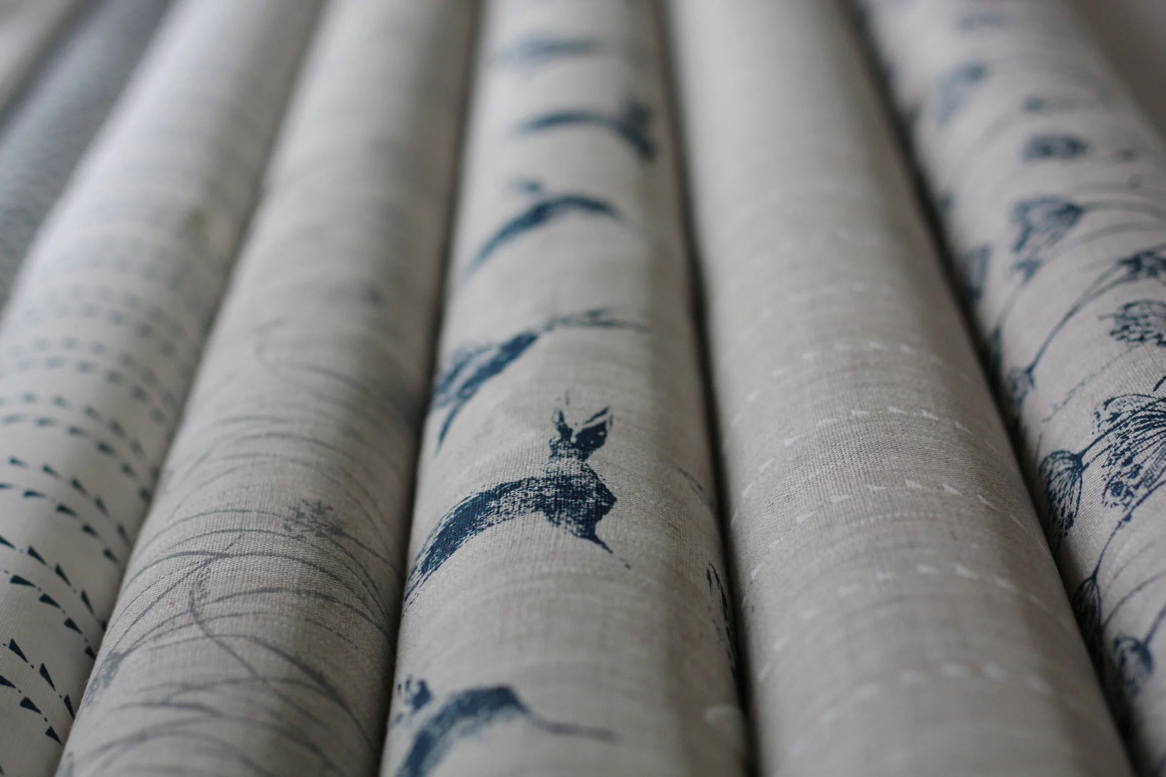
I would try and select a favourite or ‘lead’ print. Again if you’re going for wallpaper this is likely to be the wallpaper. In fabric this is sometimes one with a bolder, larger scale or more prominent design so for example it might be our Whirlwind or Bollin Bird print. The lead fabric maybe what you’re chosing for curtains or perhaps just as accent cushions. For country homes our Adlington Cowparsley works beautifully. This maybe your chosen one for curtains or blinds or perhaps one that you just want to use as an accent in cushions as you might prefer to have a more subtle print in window dressings. Remember if you’re new to using patterns if you’re doing curtains, that when they’re closed a bold print will be very prominent in a room. Chose wisely - you’ve got to LOVE the design you use for curtains.
If you’re new to pattern, and are a little apprehensive about making the right choise, chosing stripes or smaller scale designs may suit you. They won’t dominate a room and remain timeless over the years. Try our Slade Stripe, Windmill Wood, Mottram Meadow, Feather Blade stripe, Honeycomb.
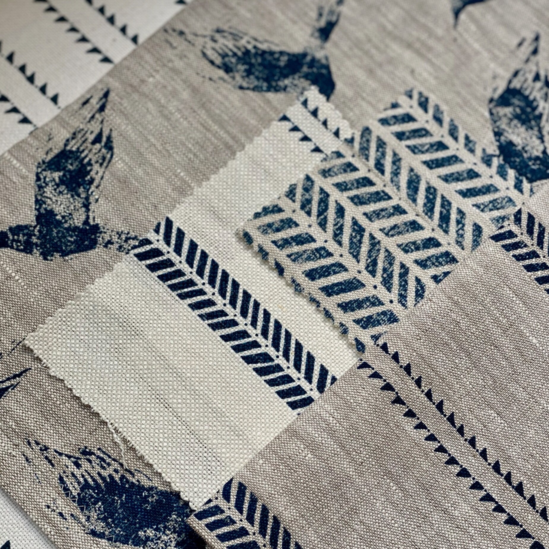
Once you’ve chosen your lead print, consider layering your scheme with complimentary prints eg smaller scale (if your lead print is large scale), stripes to work with it as a second and third print. Here are some print combination ideas below.
If you’re upholstering furniture I’d opt for stripes or smaller scale designs for larger furniture pieces and if you’re bold enough the large scale prints for stand alone chairs or footstools (eg: Fallen Leaf or Whirlwind).
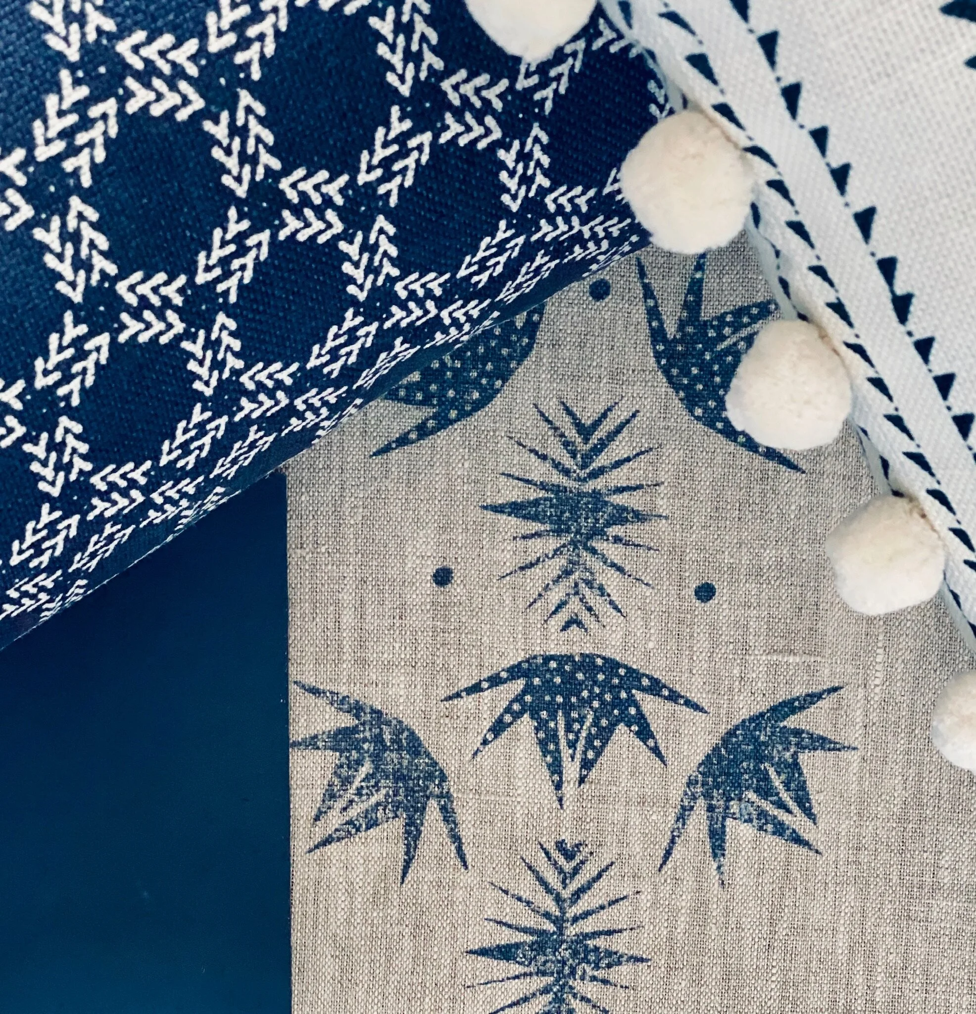
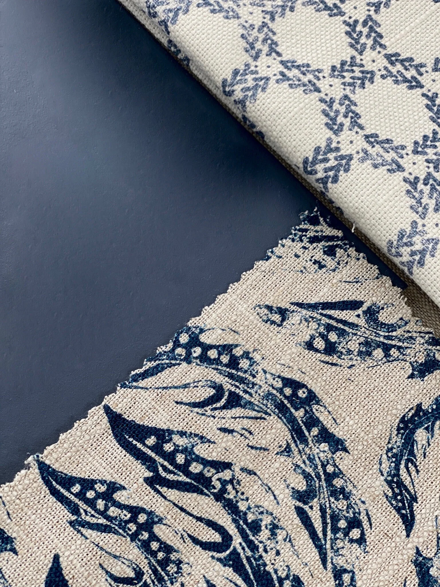
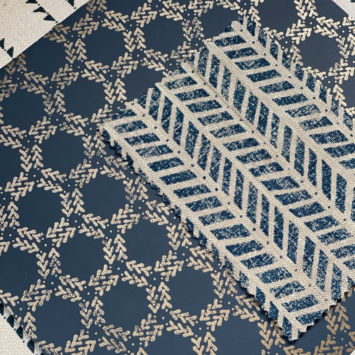
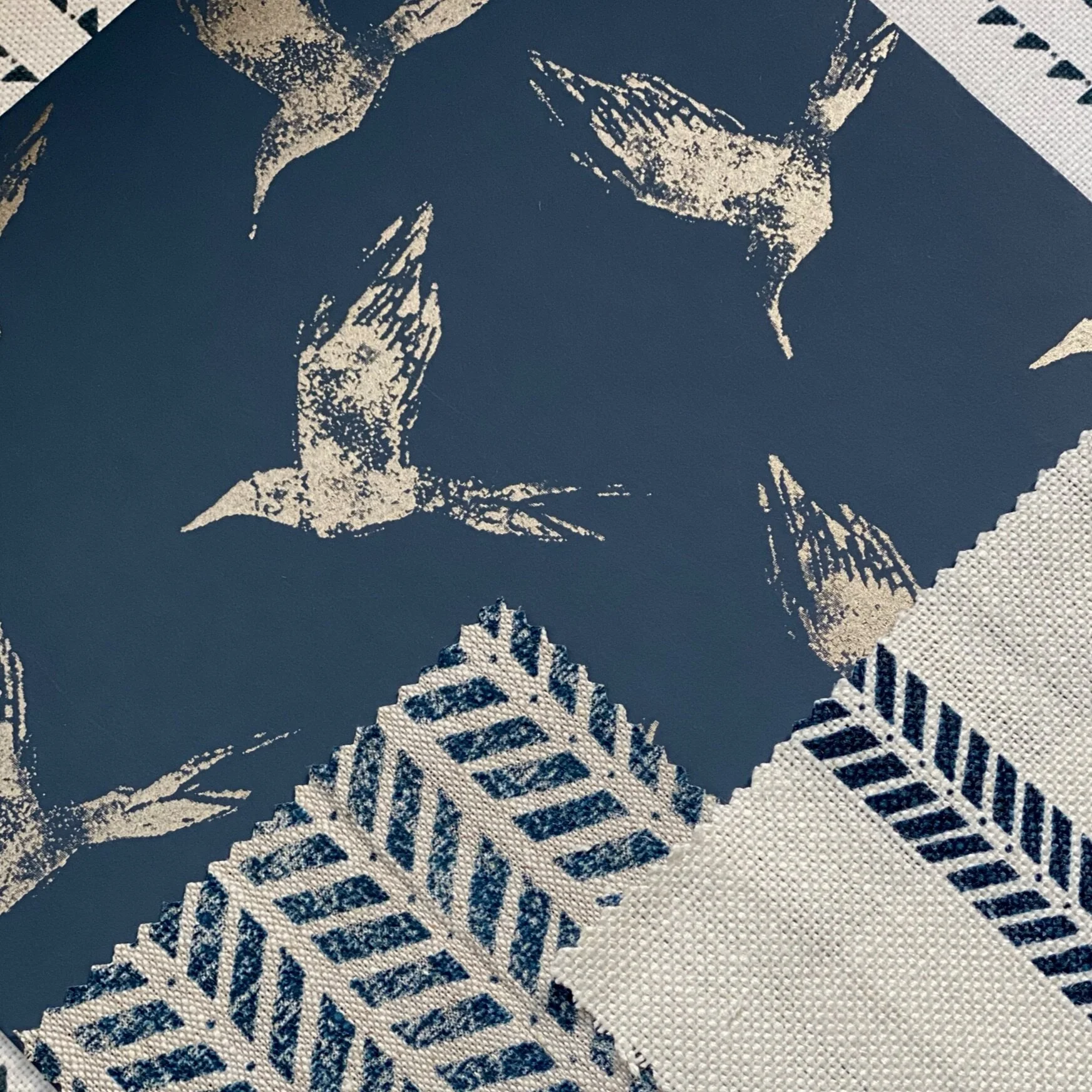
Take a look at our snap shots of swatches which we would combine to create a scheme. Which would you choose?
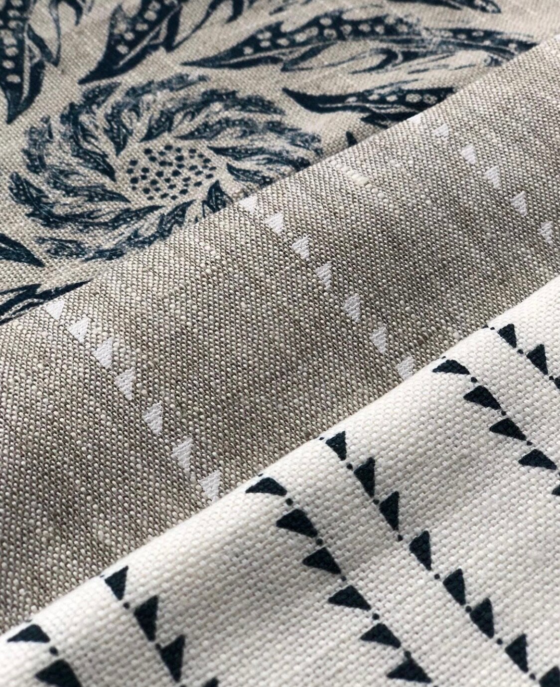


Finally consider colour contrasts. If your selection consists of printed natural base linens consider adding in a white based one to lift your scheme eg: Slade Stripe Inky on white or Windmill Wood Inky Sky Linen blend (as cushions). Adding cushions with pompom trims can lift your scheme. Consider how you are going to accessorise your room perhaps with flowers, artwork, candles or ornaments. This is a great way to add punchy contrast colours such as lime greens or yellows through flowers or artwork to balance with the dark blue.
Lampshades:
Lampshades are a great way to add in pattern into your scheme, usually in a way which complements your chosen curtains, cushions etc. If you’ve chosen stripes and smaller patterns for curtains and blinds then lampshades would be a great way to add in a bolder print (eg Bollin Bird or Whirlwind) or vice versa. All of our lampshades are handmade to order and can be made in any of our fabrics so when you go to our lampshades page if you don’t see what you’re looking for just email: sales@zoeglencross.com and we’ll make it happen!
Accessories:
Changing door hardware such as changing knobs and handles on cabinetry to copper, brass, steel or iron in order to link with new schemes can make a real difference. Brass hardware looks great where rooms include dark blues, teal or yellow tones in fabric/wallpaper. Steel or copper looks great with blue and white.
Bedroom Scheme using wallpaper:
Take a look at my little video which talks through how to approach using dark blues in a bedroom using wallpaper.
Goodluck with your design and please do not hesitate to contact us for a little help: sales@zoeglencross.com