
Little Greene Paint Company: Which colour....?
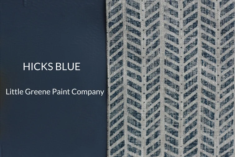
It can be overwhelming finding the right room scheme. If you are working with a blank canvas it's hard to know whether to chose your paint or curtain fabric first - it's a bit chicken and egg. The key is to chose them together if you can. To make life easier we have best testing out Little Green Paint Company's lovely blue and grey paint colours which include some stunning new shades. Little Greene clearly love grey and blue as much as we do as they've given these colours their own little colour chart. These colour tones are ofcourse still incredibly popular and look smart and stunning when combined with the right fabric in the right room. We wanted to find out which of the Little green paint colours best compliment our fabric prints. We particularly loved the Little Green paint colour Hicks' Blue which seems to perfectly compliment our Inky Sky indigo print tones (pictured below left with Mottram Meadow Inky Sky). This makes a striking and inviting sitting room or dining room scheme. These indigo blues work just as well in a modern new build as they do in a period building. I live in a recently converted barn so we have to strike a balance between old and new which can be tricky.
For a true grey colour our favourite is Little Green Paint Company Urbane Grey - this mid grey tone would look just as good on kitchen units as on sitting room/dining room walls for a more masculine smart interior - we would recommend this in a sunny, south facing room. Urbane grey blends beautifully with our Rock Grey printed linens. Little Green Paint Company's Inox is a paler (pictured top left below), pretty grey tone which has a touch of blue to it. Again it blends well with our rock grey prints. Lovely for a sunny bedroom with our Putsborough Cowparsley linen print in Rock Grey.


We'll be experimenting with more Little Greene paint testers in the coming weeks and will keep you posted. Zoe x